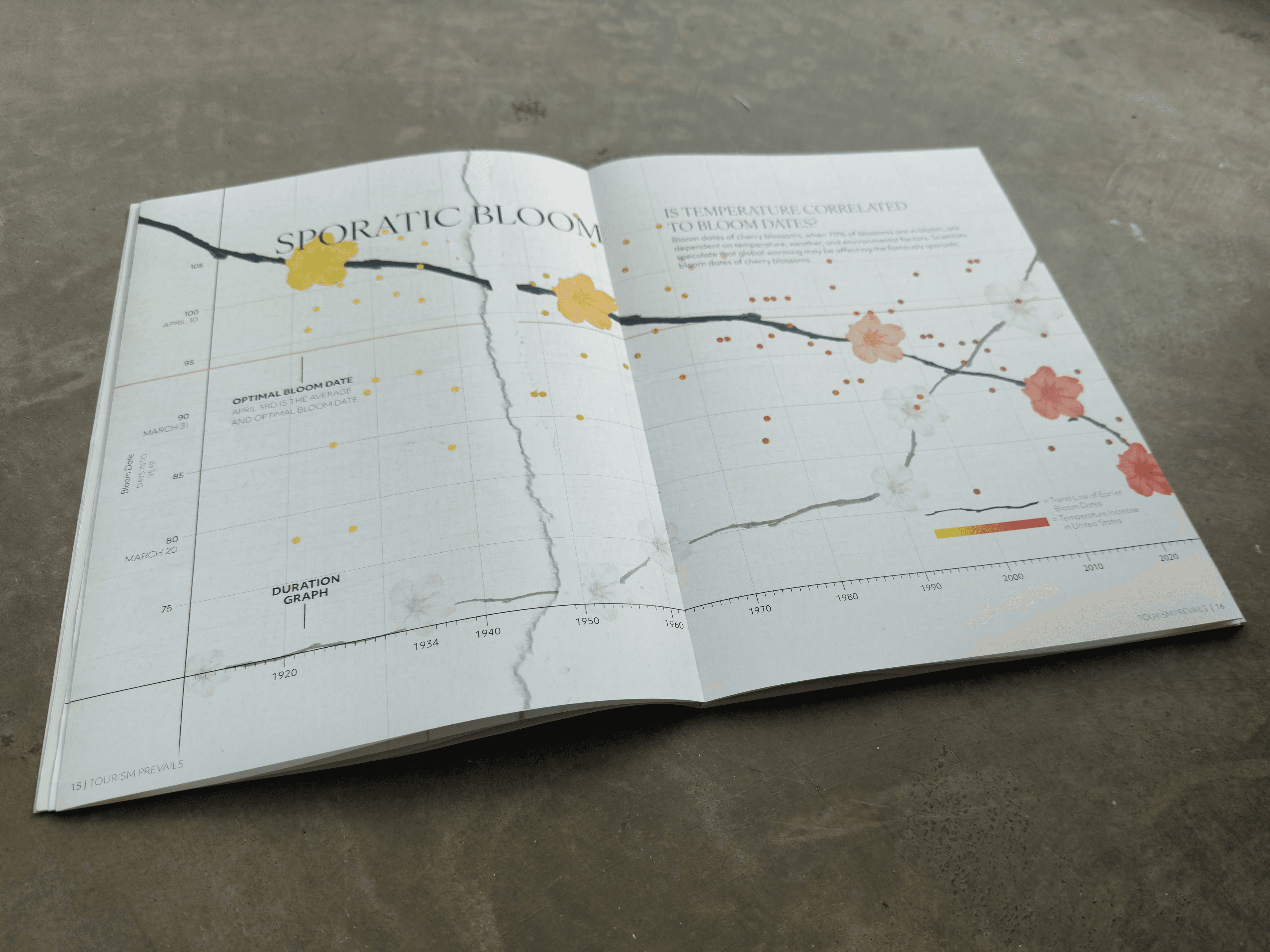
Data Visualization
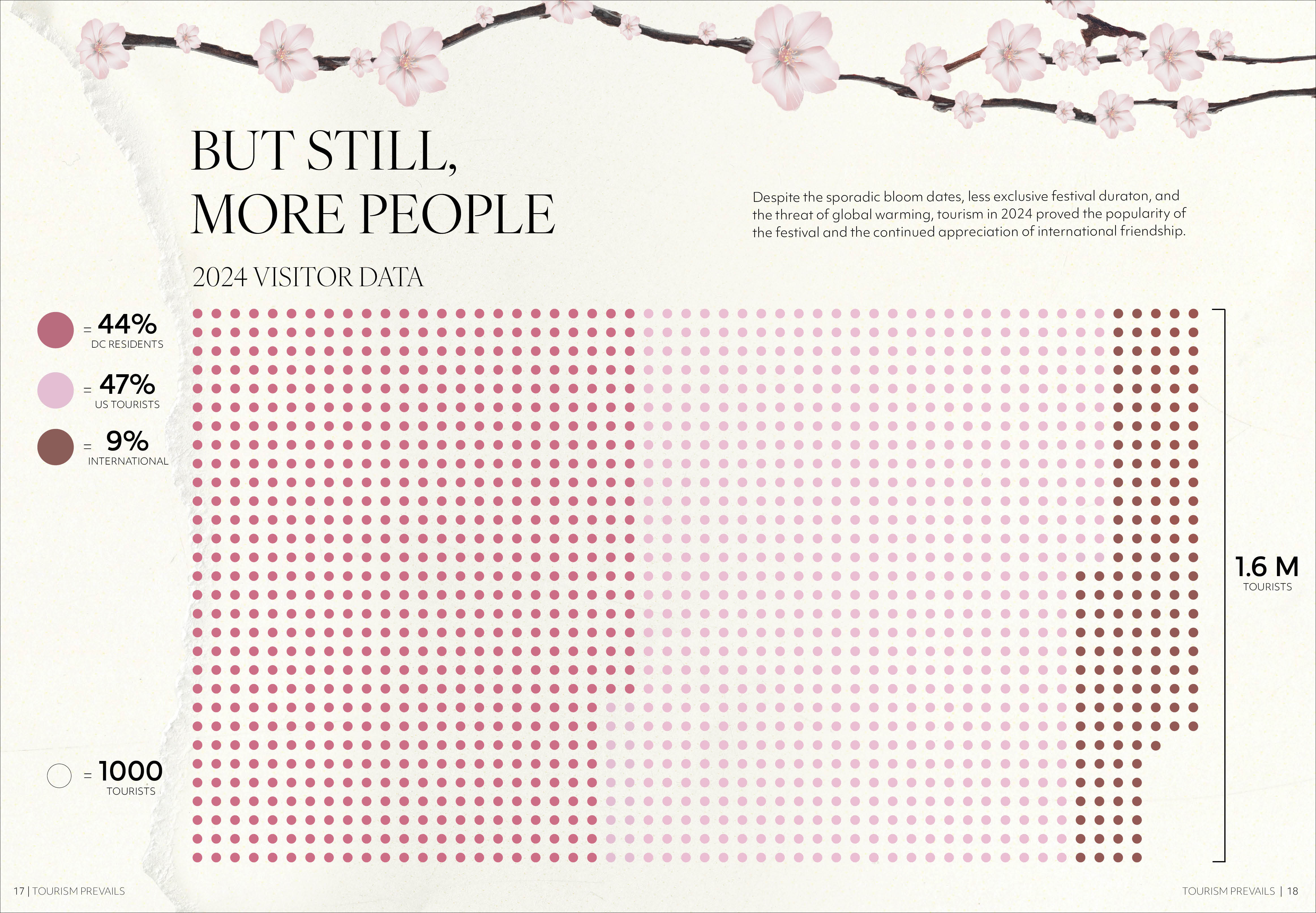
Pulling data from the US EPA, Tourism Prevails is a series of magazine spreads that tells the story of the Cherry Blossoms in Washington DC. By comparing bloom dates, tourism data, and global temperature change, the spread utilize a coherent visual language to present the data beautifully and productively.

PROCESS
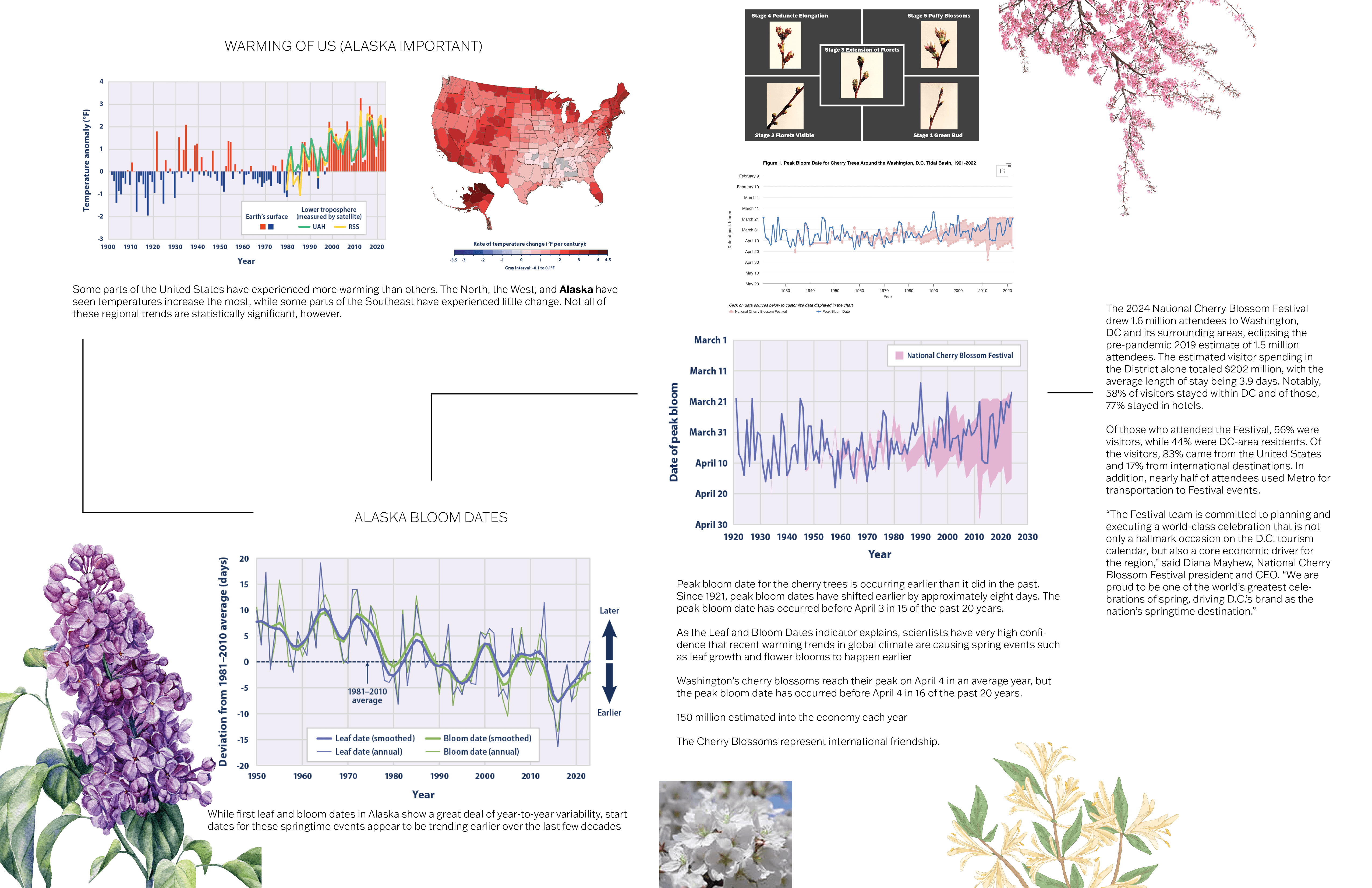

In order to think about the visuals of this project, I needed to become familiar with the data set and also any visual language surrounding the topic of Cherry Blossoms. This involved studying existing graphs and data sets as well as studying the inherent visual language of cherry blossoms.
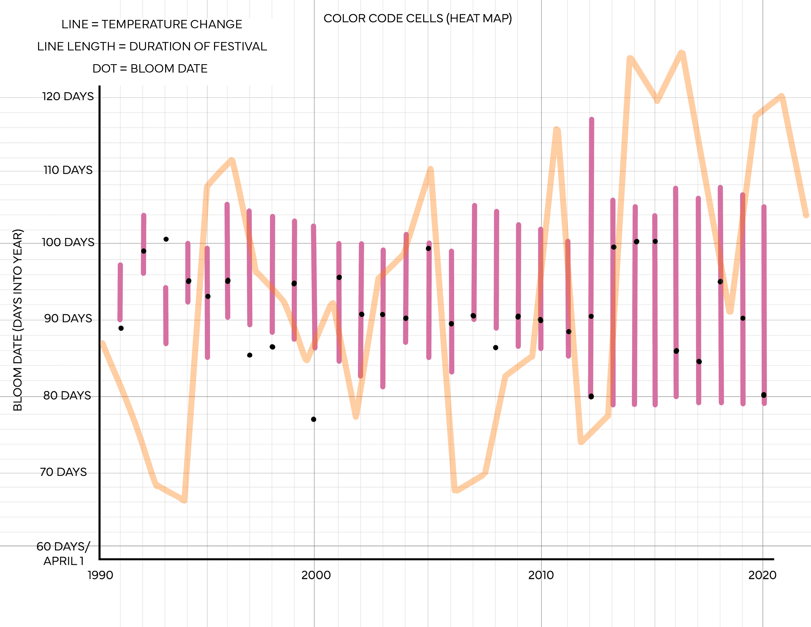
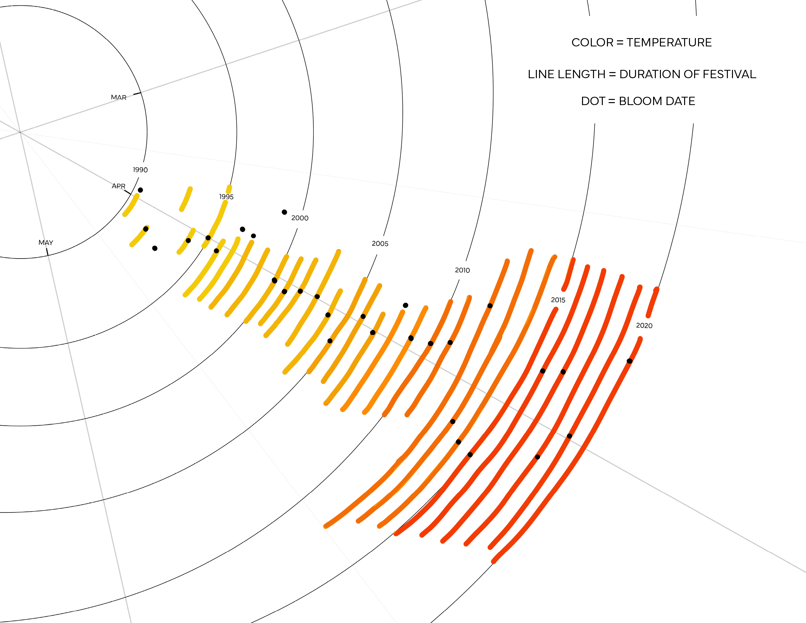
I wanted to dive deep into the data to see how much I could represent in one encoding, finding the limits of a single visual without thinking about a visual language yet would help me to create a sequence later on. Next was incorporating a visual language and finding a way to split up the data that made sense in a sequence. I wanted to lean into the use of negative space and full bleed simplicity found in Japanese design.
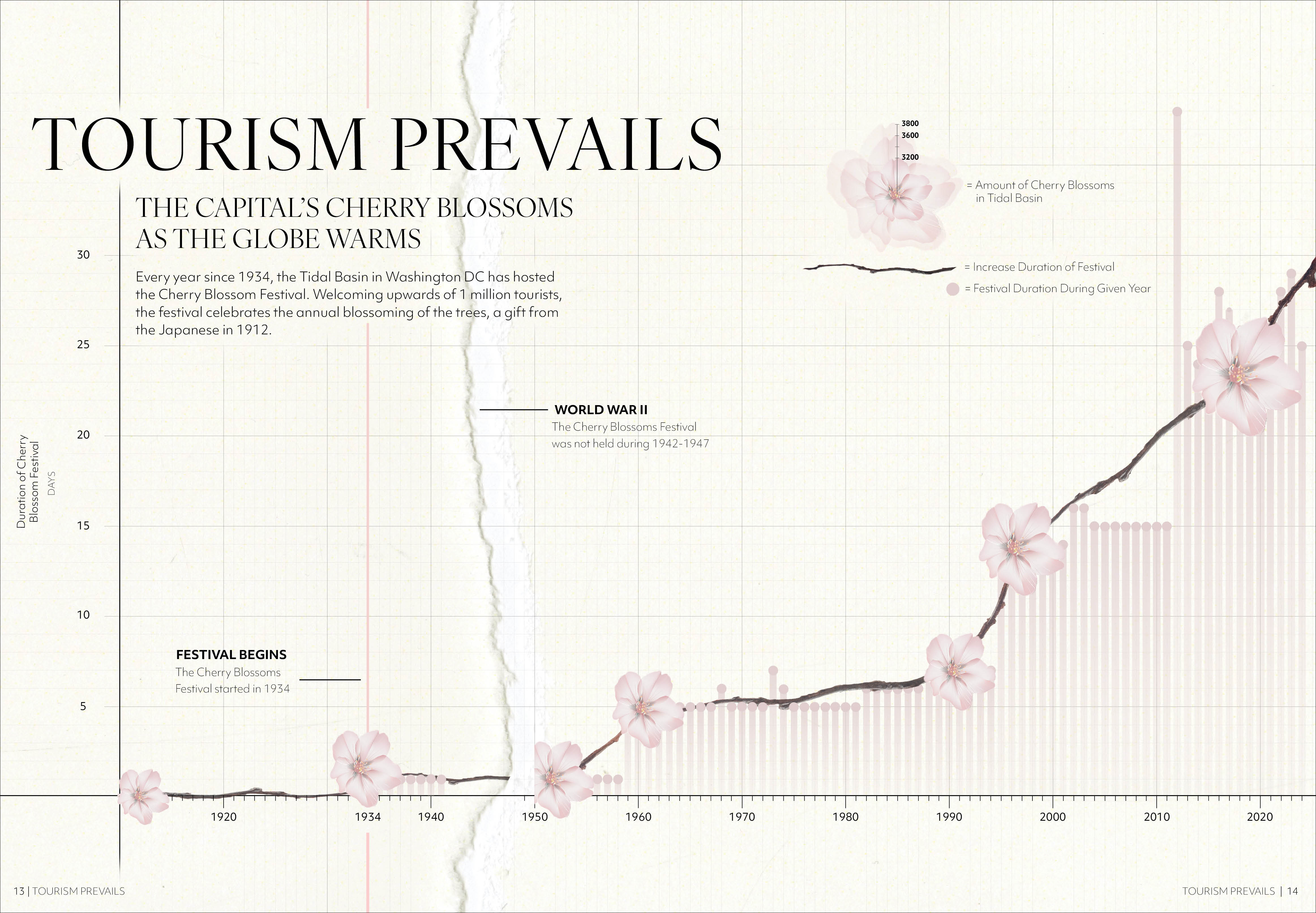
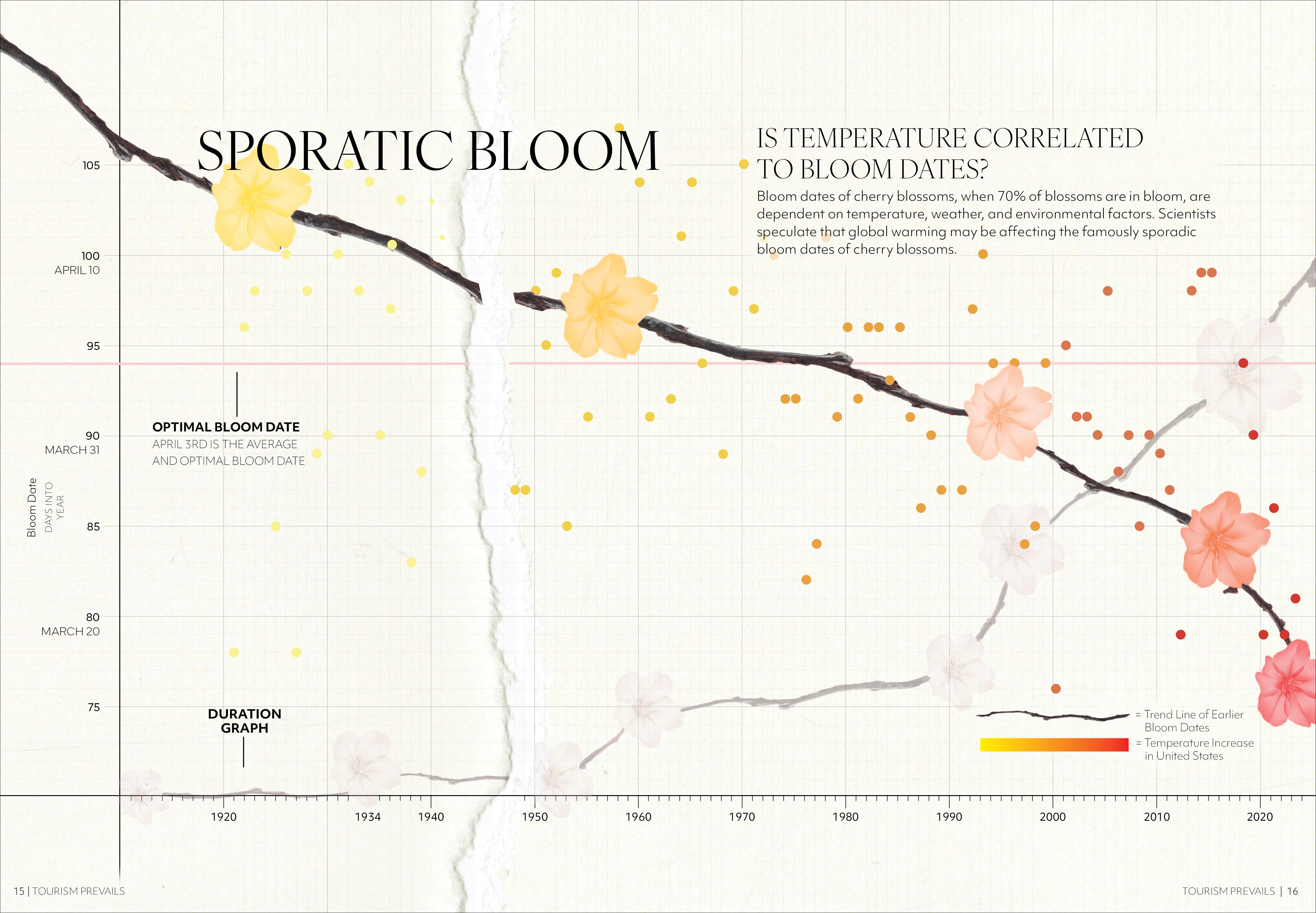
I made progress on cleaning up the typography, creating a cleaner system that could accommodate more complexity like additional labels and information. I also wanted to disrupt the flatness so I scanned in ripped paper to created an actual void during the World Was II period. Finally, the encoding of the final sequence shifted completely, sharing the language of the other spreads while becoming a different kind of encoding that responded better to the different type of data.