Book Design
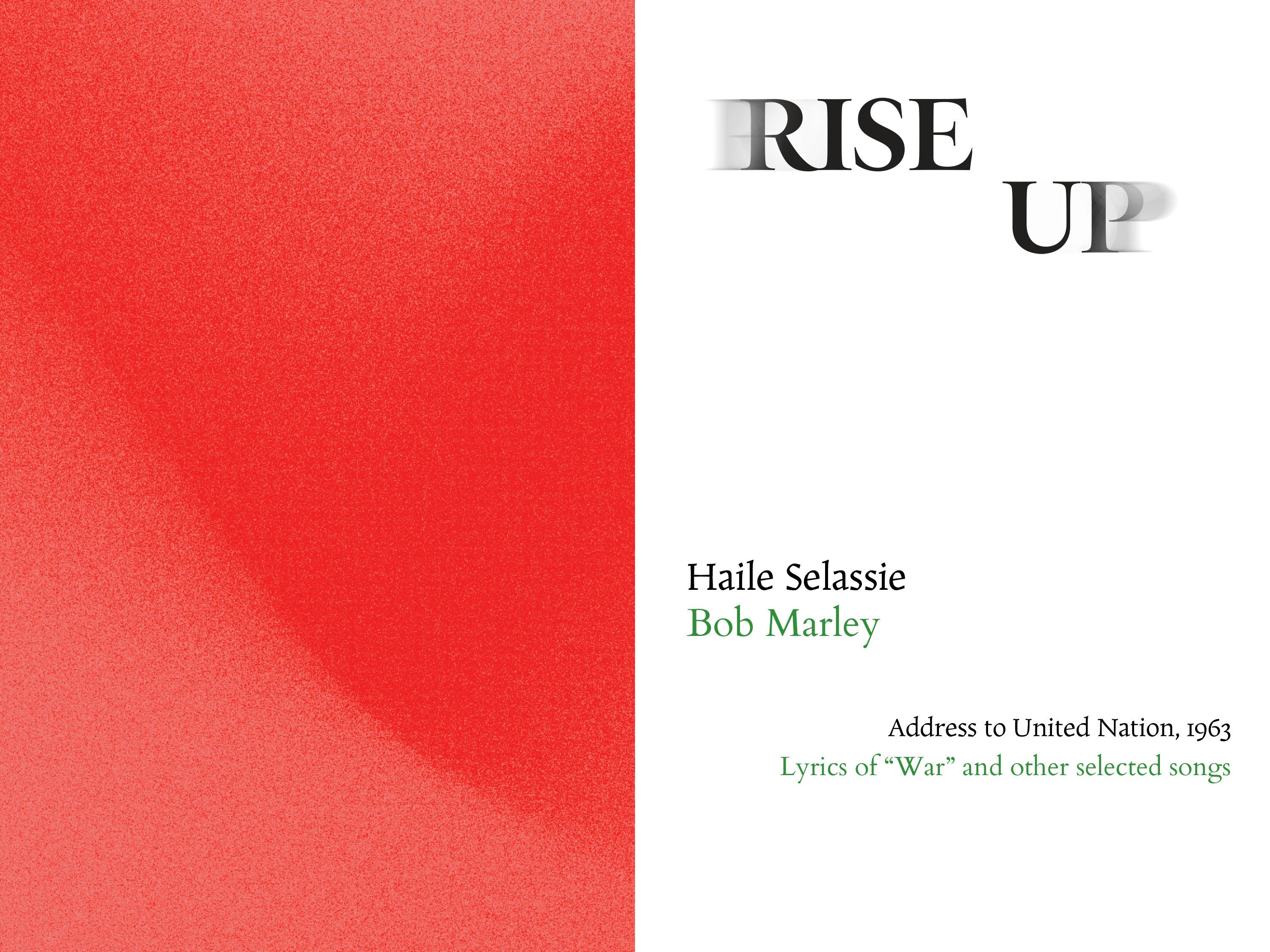
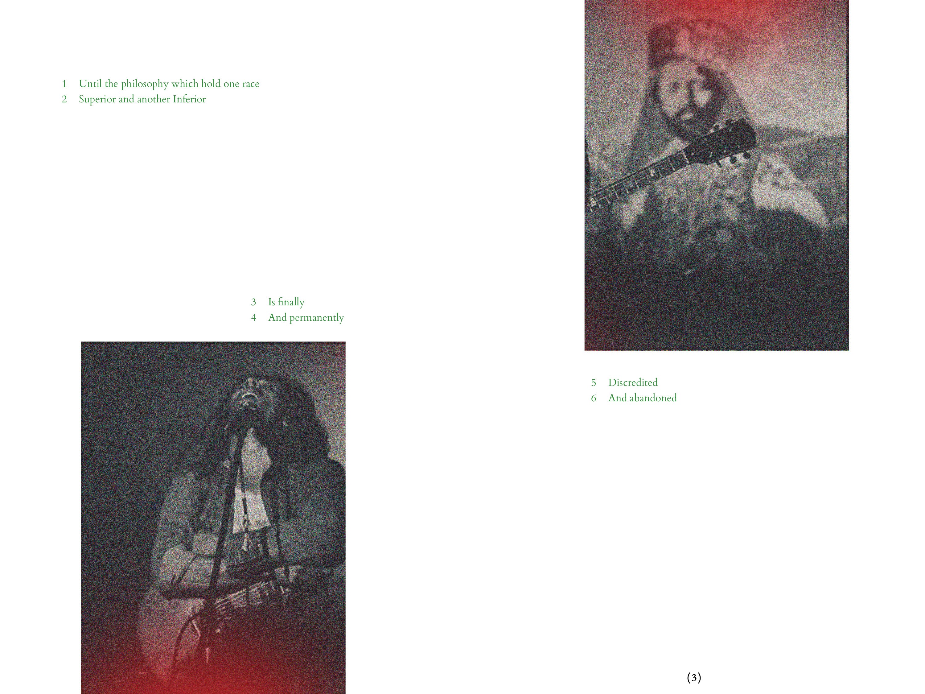
A book intersecting Haile Selassie's speech to the United Nations in 1963 with Bob Marley's lyrics of War and other selected songs. Rise Up combines visual themes of religious texts and manipulation of found imagery to weave together the voices and tell the narrative of protest and unity.


PROCESS


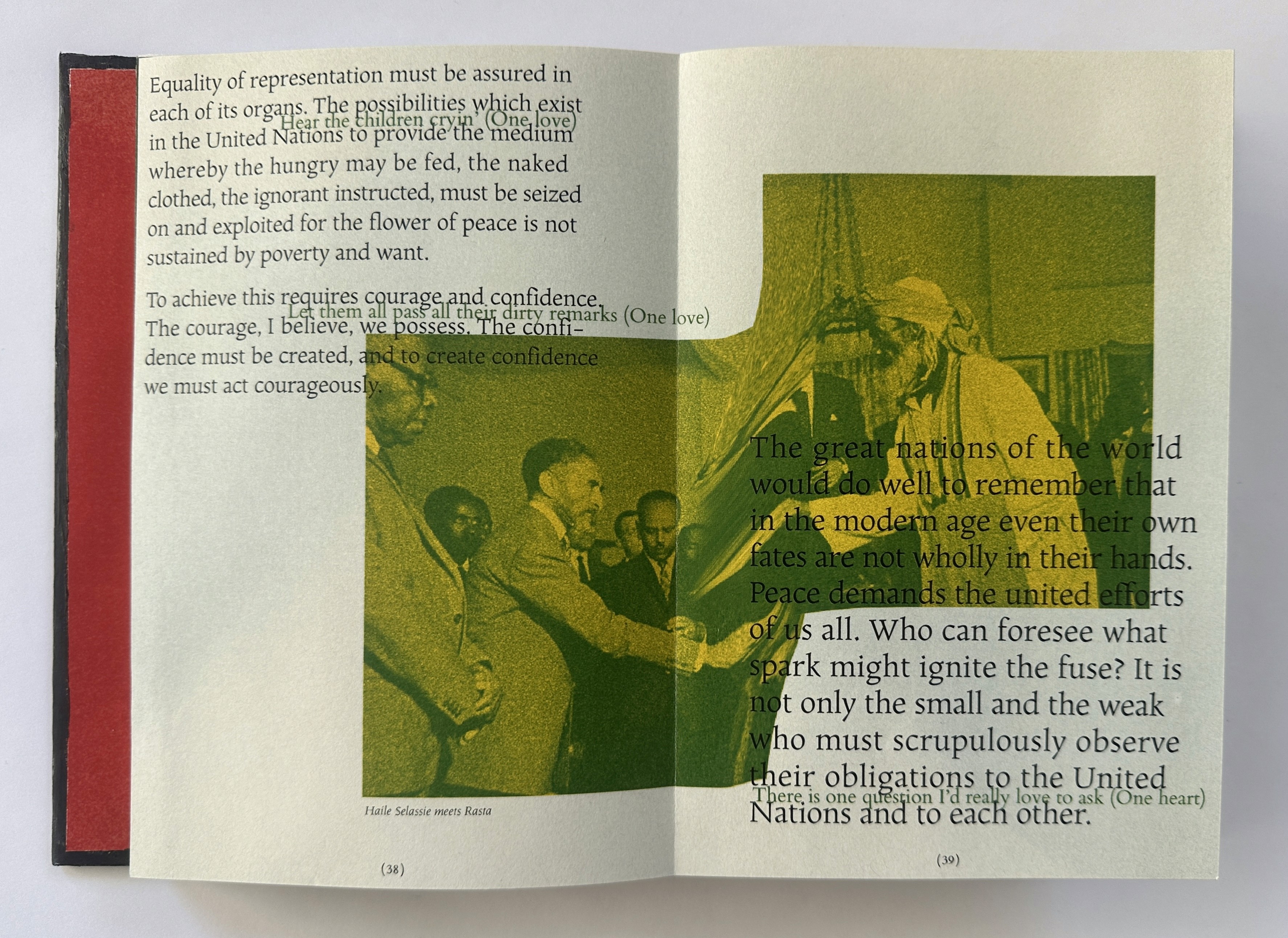
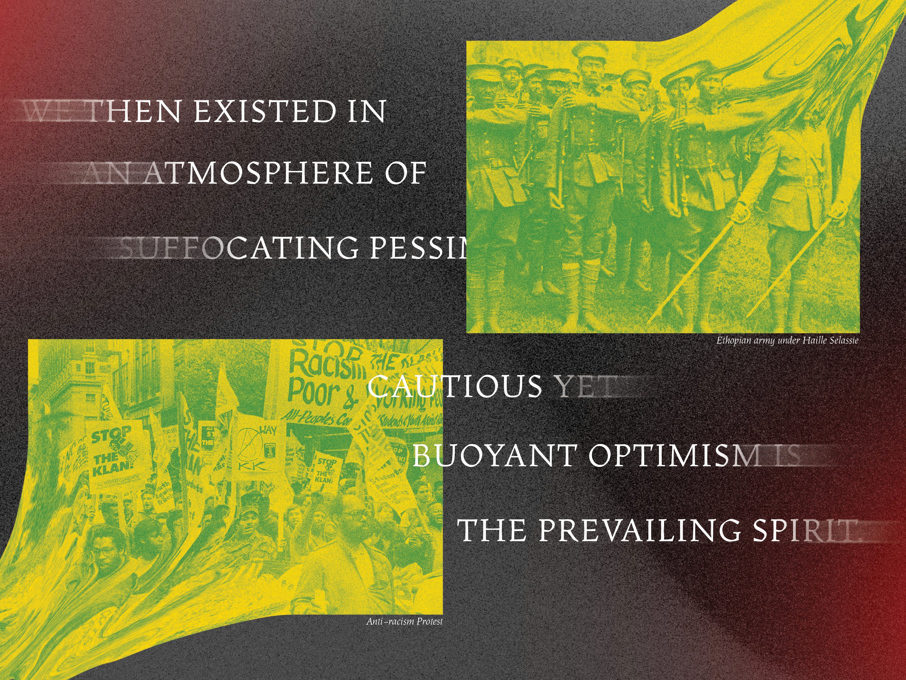
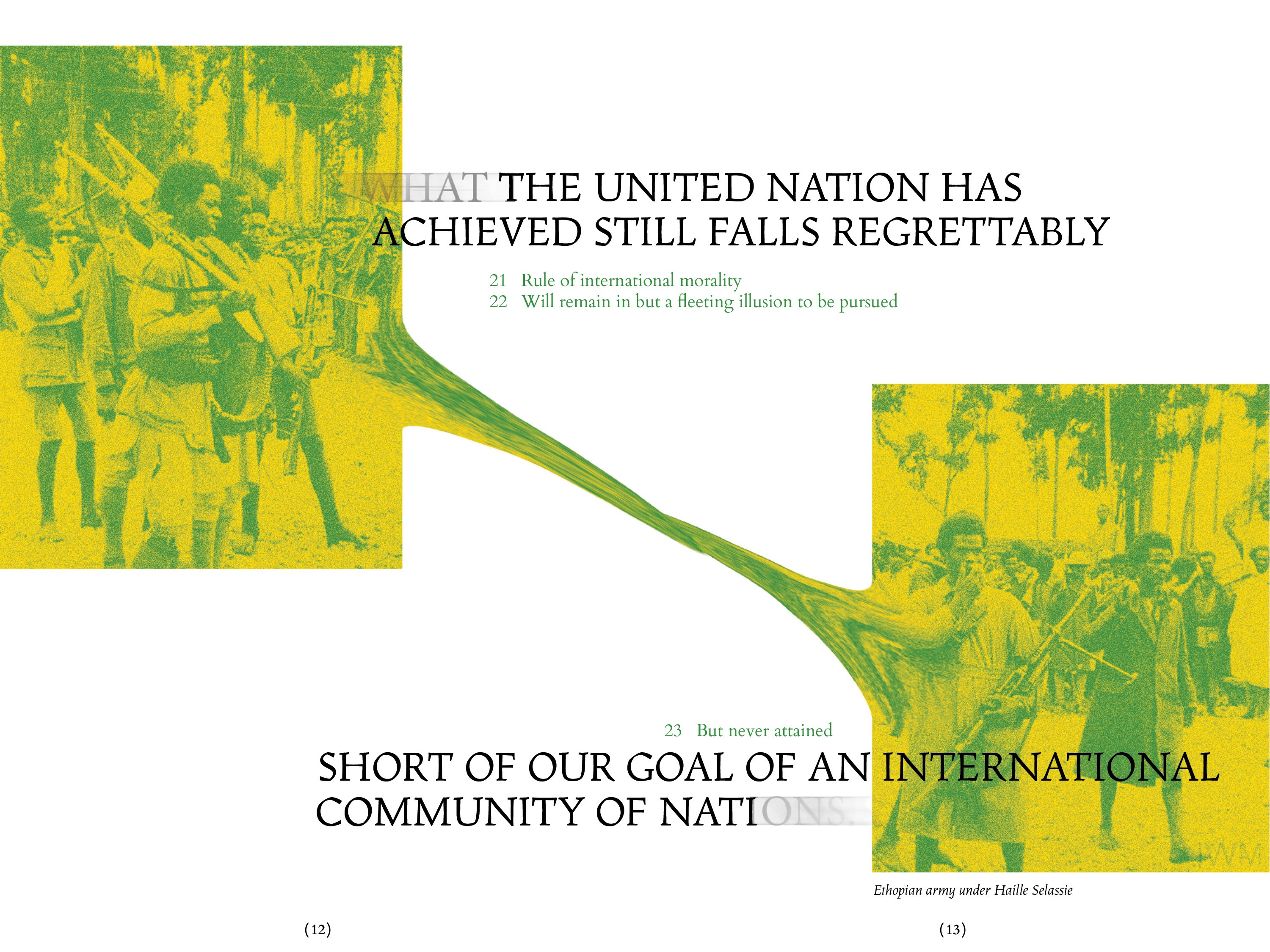
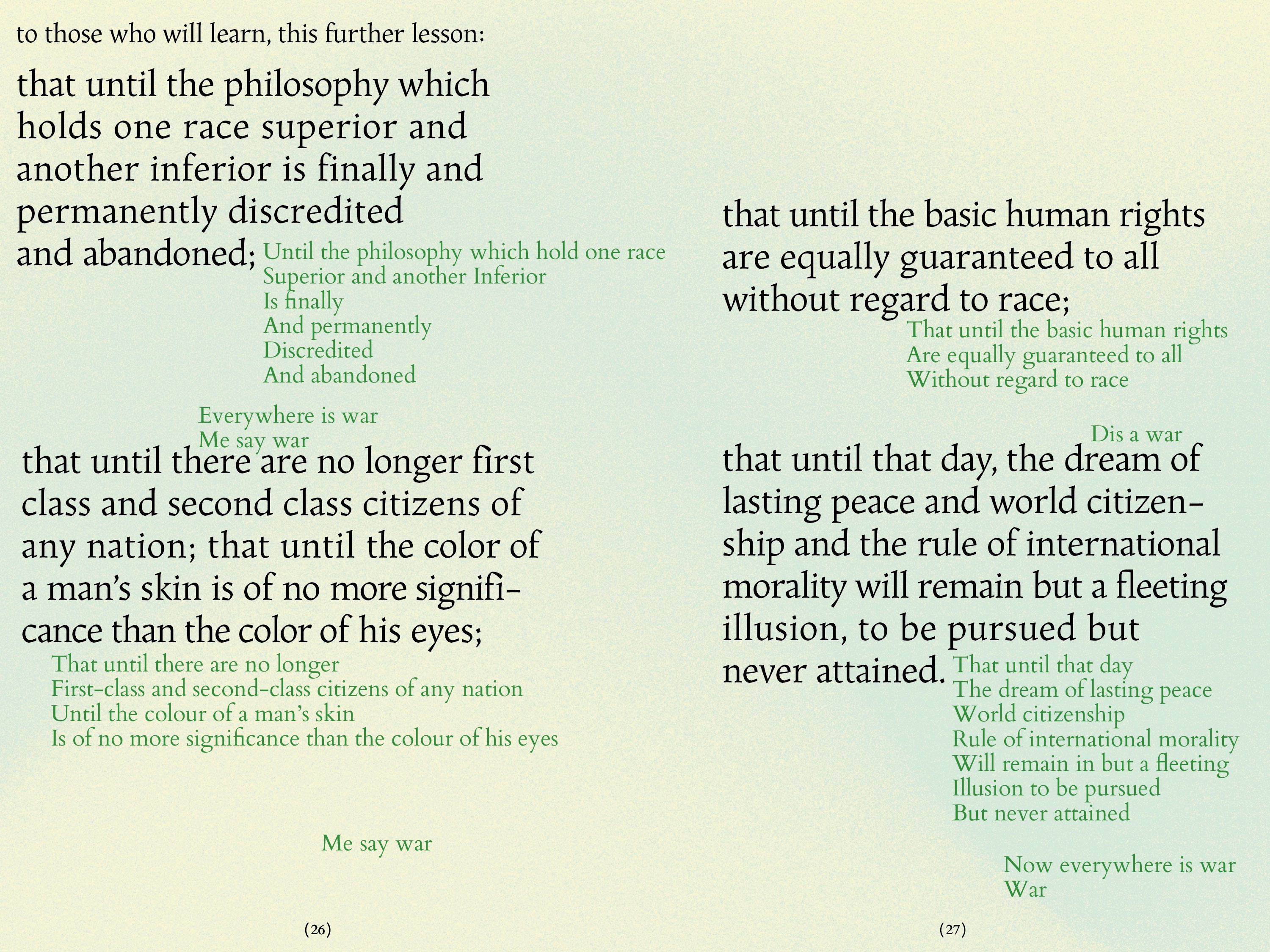
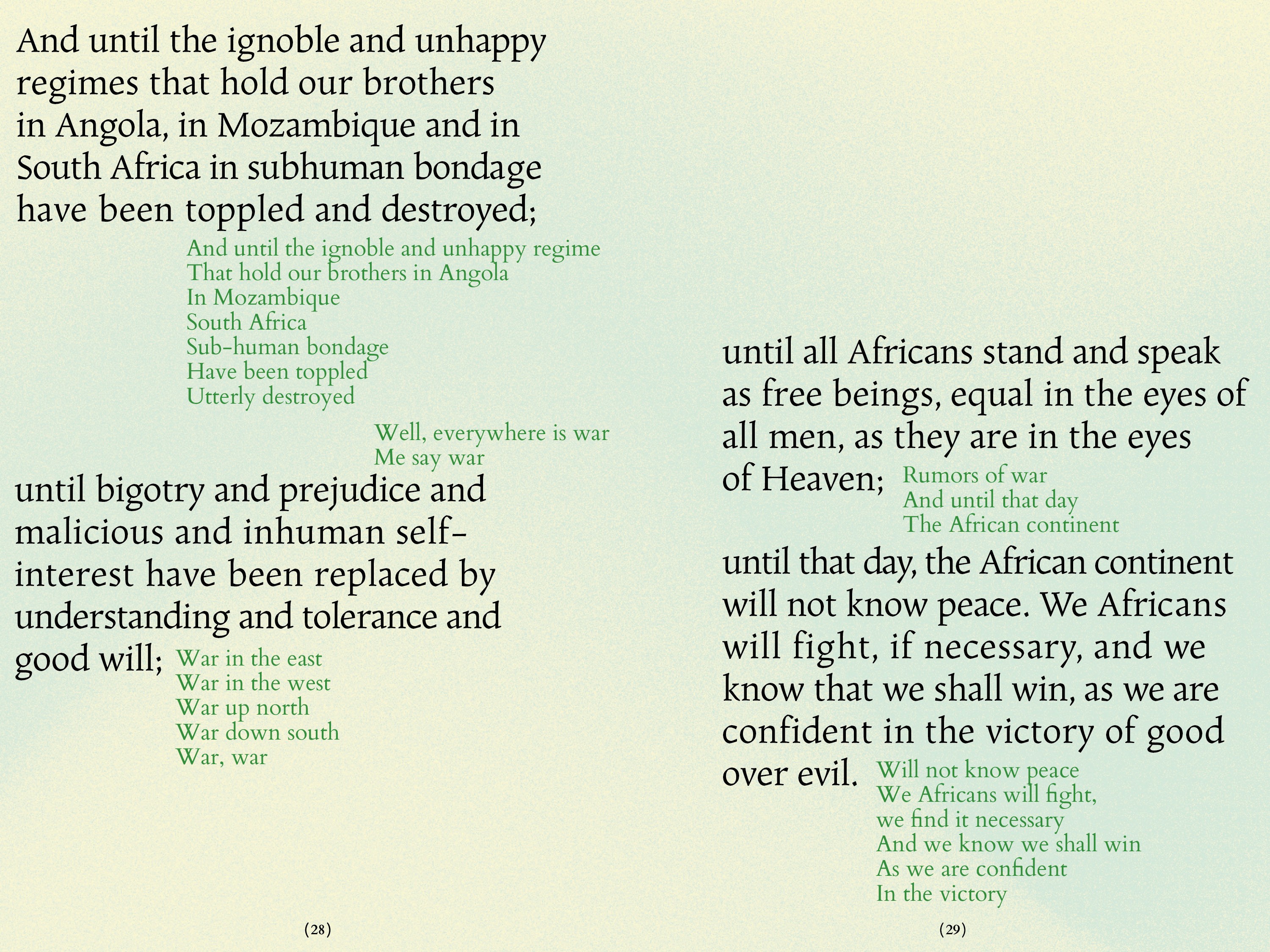
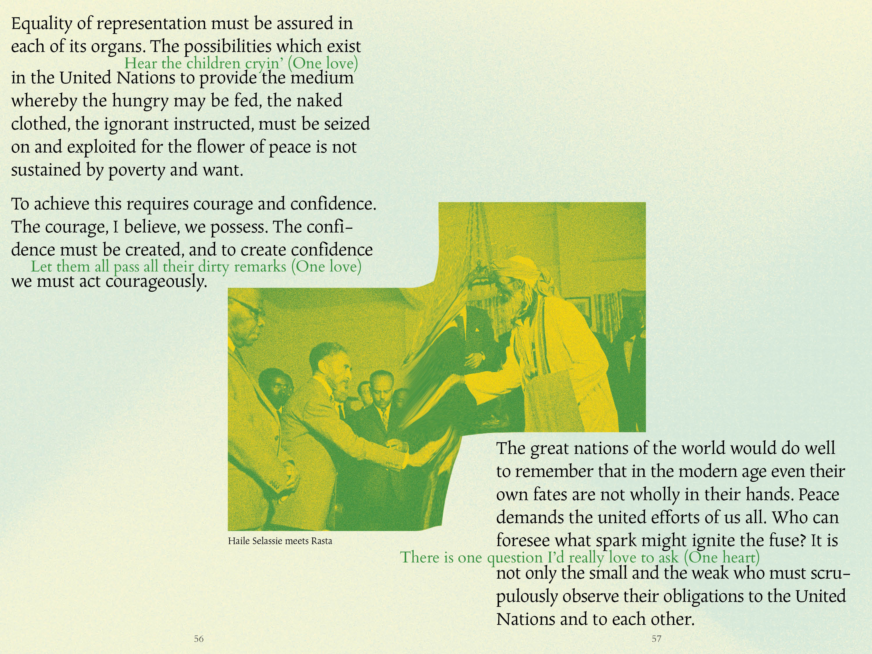
I was drawn to the relationship between Haile Selassie and Bob Marley because of the many themes that brings them together. Because of the religous connection of Rastafarianism, the rhetoric they used in their speeches and songs respectively often overlapped. Early on, I was interested in finding visual sources that showed the various languages of music, protest, and hope. I found myself being really attracted to images of Selassie and Marley because of the presence they had as figures and what they really represented as icons. Meanwhile, I was also thinking about how these two texts can really intertwine within the design, sharing space and playing off each other’s language. Of course, the plea for unity and freedom from both figures and texts comes out of an ongoing conflict of colonialism, war, and violence. This concept was playing up the harsh realities that made the need for figures like Selassie and Marley as peacemakers while balancing it with more positive views fo peace, unity, and freedom.
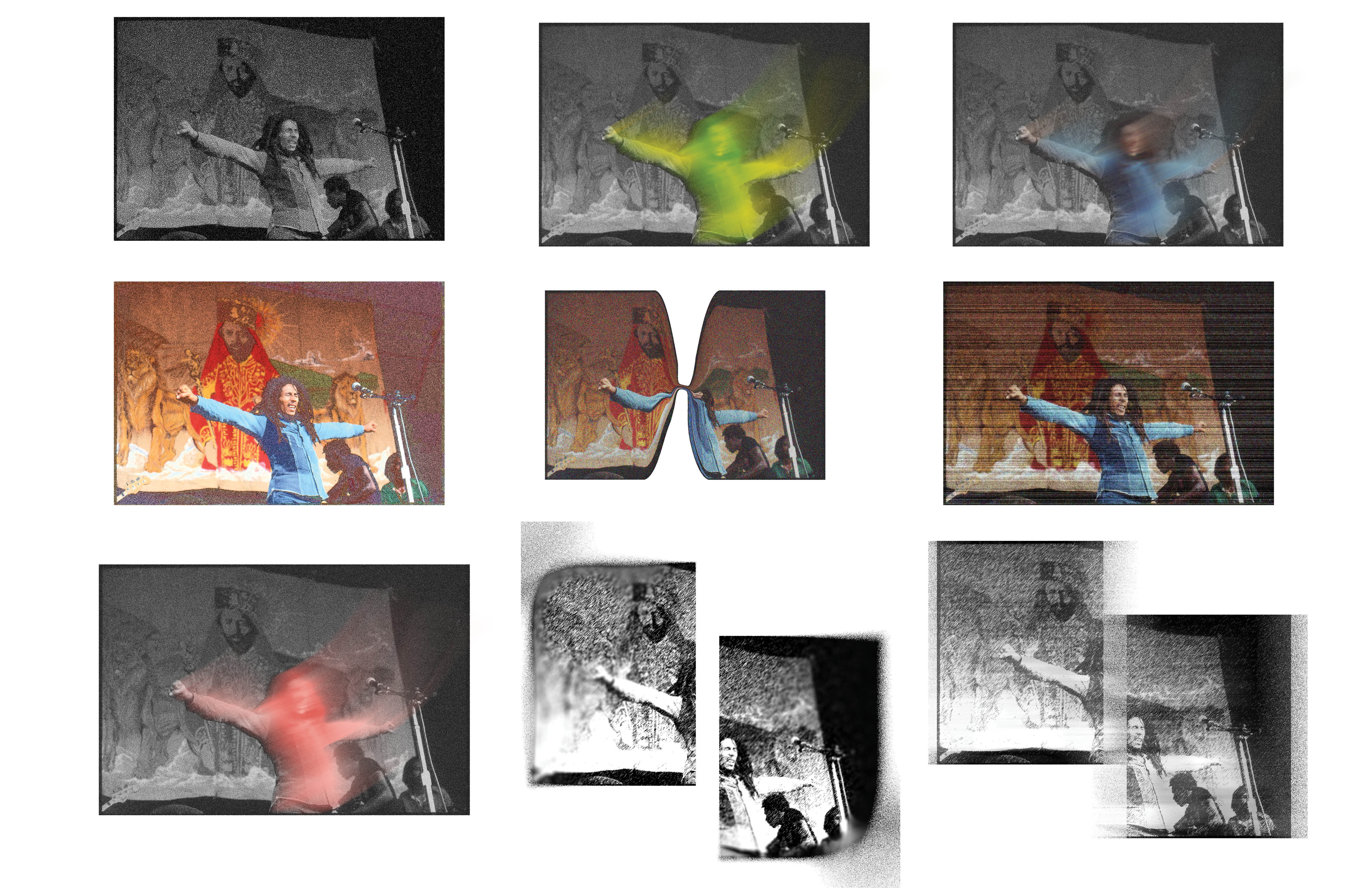
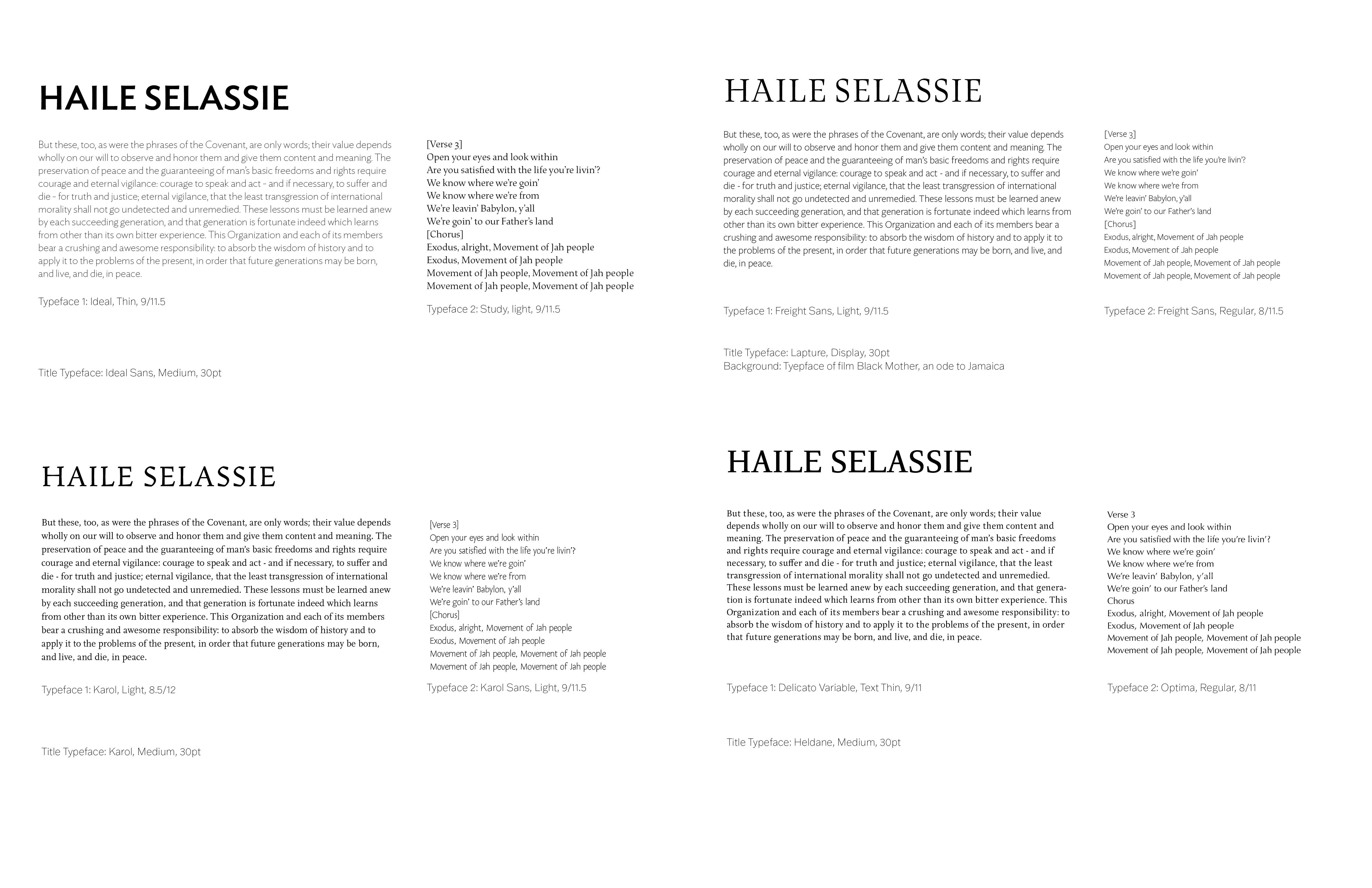
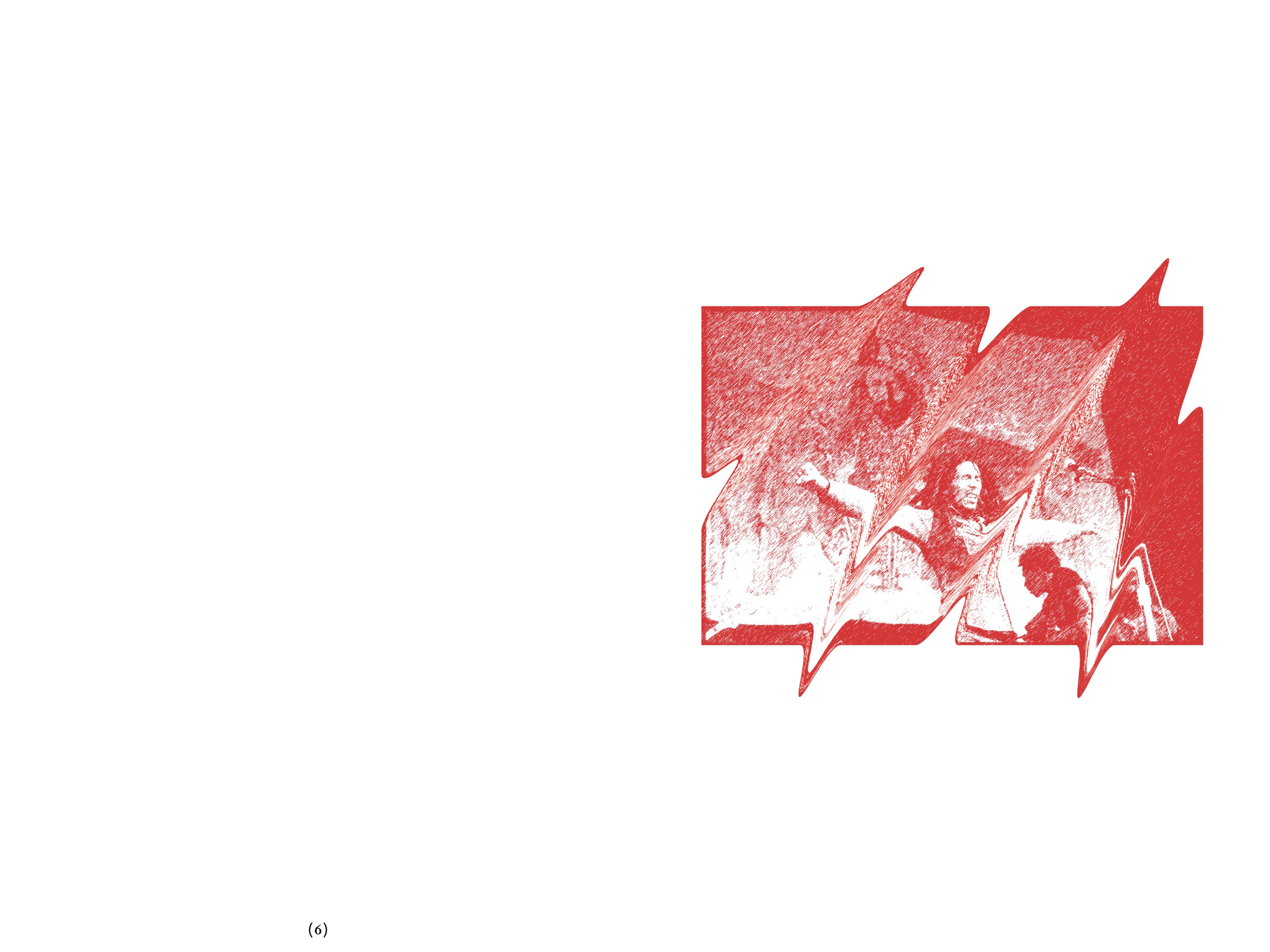
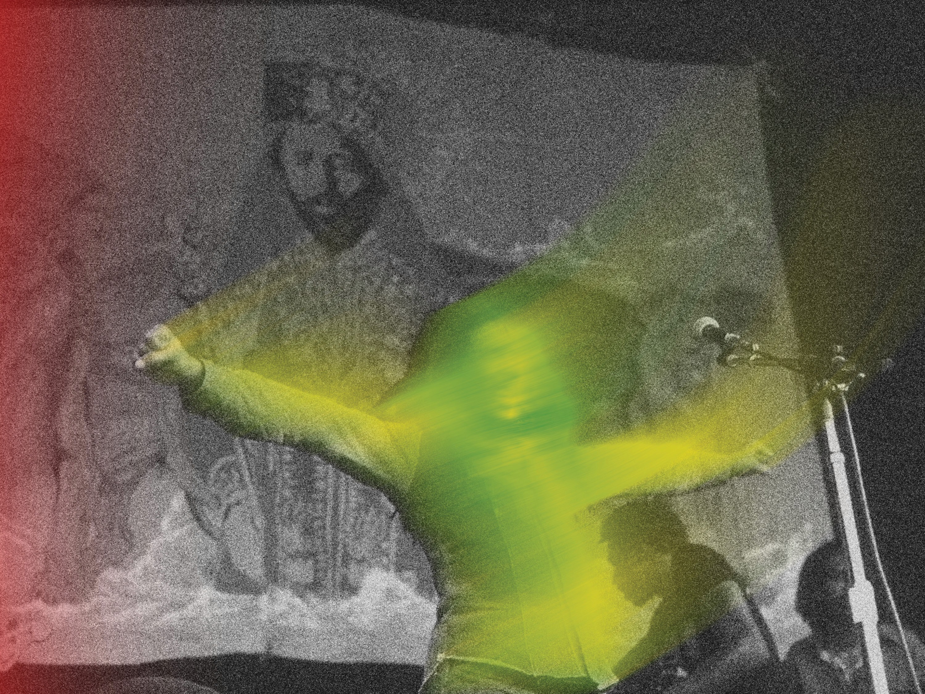
Finding type foundries from Jamaica or Ethiopia was very difficult. So, I leaned heavily on my conceptual base of religion as a entry point into my type choices. Whether it was type like Study that had religious text feelings with interesting inflections or more anonymous serif fonts like Cardo, I wanted to find something that would have nods towards Amharic script and also embody the iconiclism of Marley and Selassie as characters. I explored a wide array of what the images could communicate in relation to the themes I was choosing. There was something religious and introspective about the dissociation from the body. The splits and merging images had the potential to grow and adapt over the course of a book. Using the same powerful image of Marley and Selassie for these studies also meant I could see what the effect does to such a powerful image and really study the effectiveness of the image manipulation.
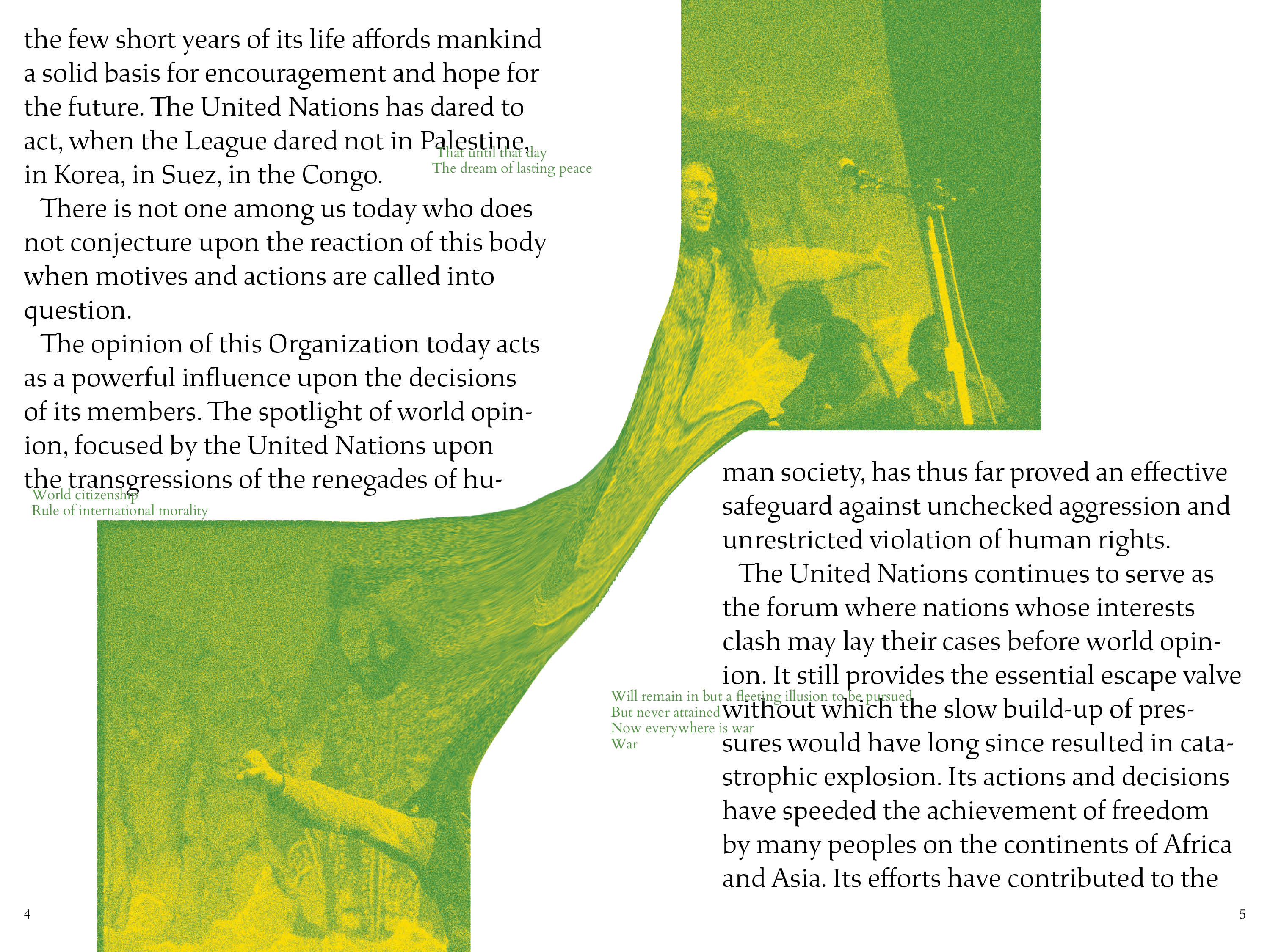

Once the system gained more clarity, there was more room for nuanced complexity. Things like effects on the type, scale, background shifts and climaxes all created more dynamic pacing. For the binding, since my book had plenty of spreads that used the gutter space, I knew I wanted to bind accordian or drumleaf. I wanted the book to have a biblical presence, playing into visual themes within the book and the size of the book. Drumleaf made the most sense since there wasn’t a reason to sacrifice structural integrity for an accordian book, it didn’t make sense for my concept. The hardcover was a no brainer, adding a presence in the hand and on the table. I ended up only binding to the back cover so the book could lay more flat.